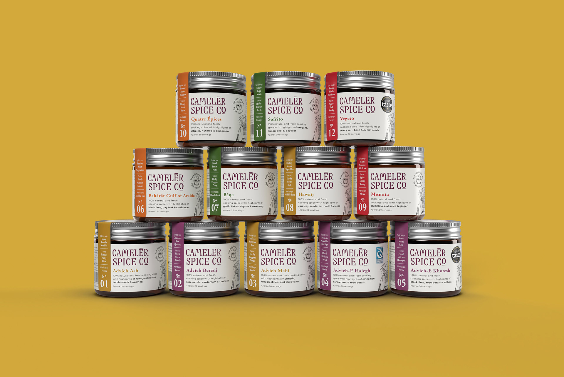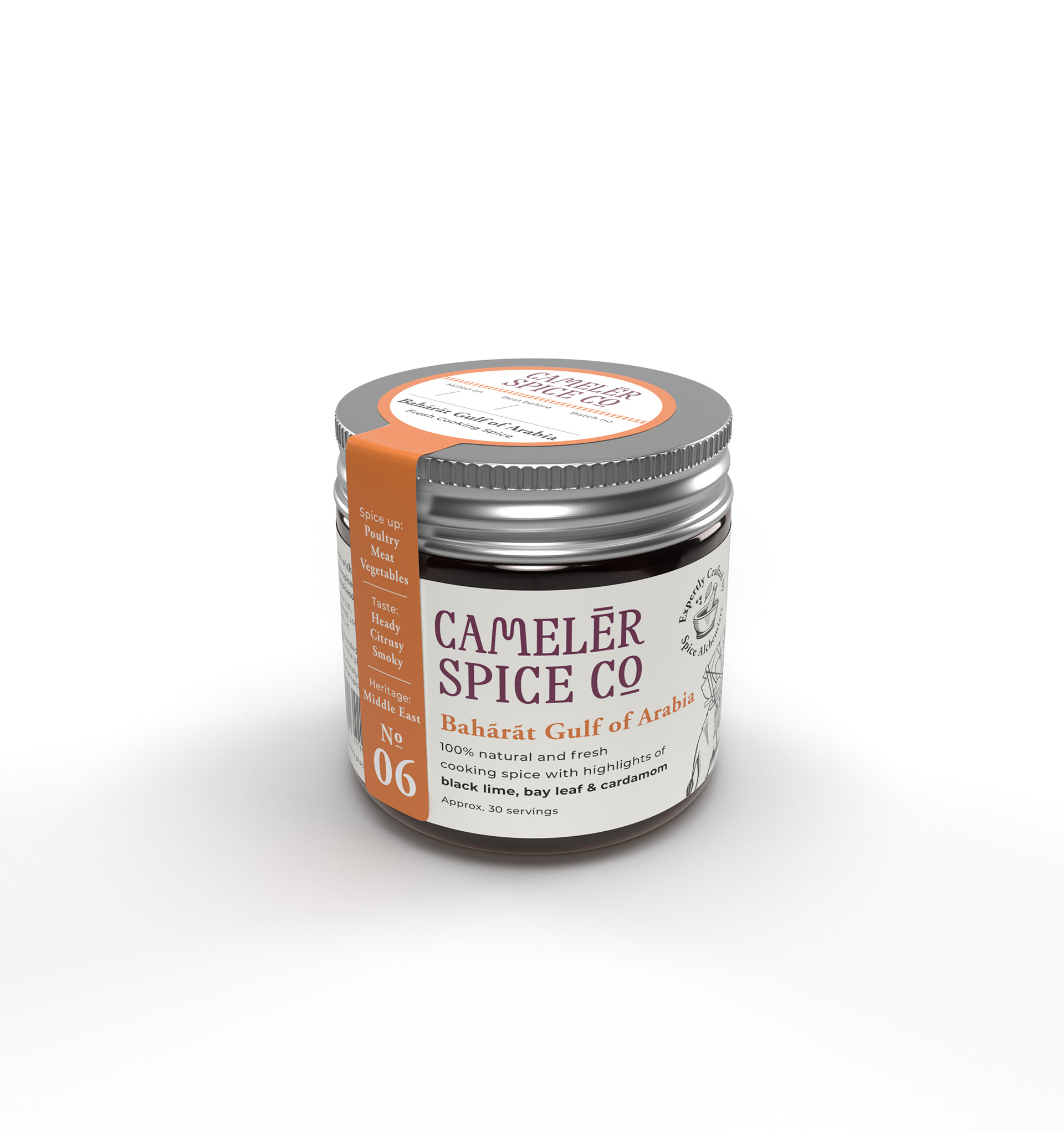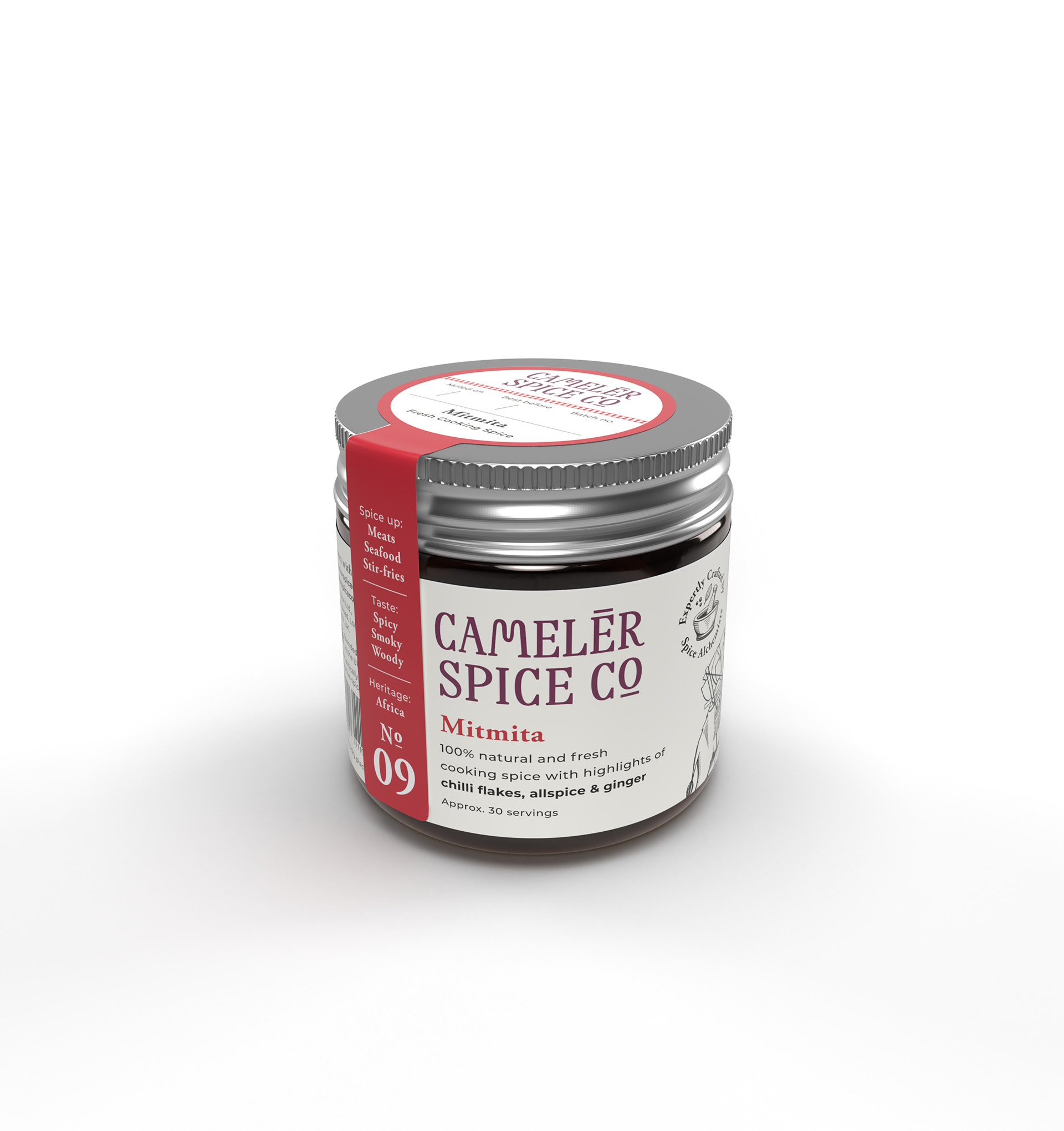

Cameler Spice Co. is a cooking spice brand, steeped in history. The company's existing branding and packaging was lacking clarity – and customers were unsure what the product was or what it could be used for. The brand needed help to communicate its offering more quickly and effectively on shelf.
Cameler Spice Co. is passionate about sourcing spices from around the globe. The brand name is inspired by the old merchants and camels who brought spices between continents. I wanted to ensure that this inspiration and heritage was communicated through the branding. More importantly, the labels needed to better highlight the blendsʼ value to the consumer – in terms of flavour, uses and recipe ideas. I established brand architecture and instated a colour-coded system, plus heritage marks and a flexible way to present the key information.
Cooking with the blends is exciting and opens up a world of culinary possibilities. The new colour palette celebrates this with bright spice-inspired hues, coupled with dusty earthy tones.